Adn├Ęne (and arabeyes folks),
On Feb 17, 2008 3:00 AM, Mohammed Adn├Ęne Trojette <adn+deb at diwi dot org> wrote:
> On Sat, Feb 16, 2008, Steve White wrote:
>
> > As Christian said, I am looking for somebody to help me with Arabic
> > support in Freefont.
> > Mostly, I need sound advice.
>
> First, thanks for working on the Arabic glyphs.
> Second, I will be happy to help you on this. But just in case, I think
> we should also add Cc: doc at arabeyes dot org so the Arabeyes people will be
> able to help.
>
OK!
> > 1) Some glyphs seem to be missing, and there is some controversy,
> > concerning 'yeh' vs '╩╝alif maqß╣ú┼źra'.
> > (see http://en.wikipedia.org/wiki/Arabic_alphabet). I played with
> > making my own medial 'yeh', but I'm not confident.
** Please look at that Wikipedia page, and tell me if it is accurate.
(And if it isn't, you might fix it!)
> Just send me a screenshot and I'll tell you. Alif maqsura is just a Yeh
> without the dots, AFAIK.
>
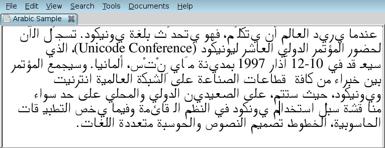
I attach a screenshot of gedit displaying some mixed text at 16pt.
It is my latest version of FreeSerif. It is different from the most
recent CVS in that:
1) the Arabic glyphs have been shifted down to share the baseline with
the Latin glyphs
2) replacements as listed in the Wikipedia page mentioned above are applied
I see immediately an issue with replacement of the character '┘Ő' (yeh).
** Are there any other replacement issues?
There are a couple of difficulties with the character 'yeh'
1) This character appears on the Wikipedia page only without dots.
So something appears to be missing on that page. What else is
missing or wrong?
2) In FreeSerif, the range of replacements for yeh
U+FEF1 - U+FEF4 is missing.
So is the range U+FEEF - U+FEF0 for 'alef massura.
I haven't yet made any changes to the glyph forms.
You can therefore look at your Linux distribution's copy of FreeFont,
to see what is wrong with the character ranges.
I'm not confident that I could make a yeh-final glyph that is correct.
> > 2) The whole glyph range is vertically offset by a large amount
> > relative to Latin glyphs, so that it looks poor when mixed with
> > Western text.
> > This is an easy fix, if one is sure of oneself.
>
> OK.
>
> > 3) I think the glyphs ar overall a bit big compared to the Latin ones.
> > Now, there are functions in FontForge to scale a range of glyphs, but
> > I really don't feel very confident about this. For one thing, there
> > are glyphs that are built from other glyphs.
>
> From what I remember when using freefont, the main problem was that the
> glyphs were small and the diacritics were too far from the glyphs.
>
** Please give me an example of a character, where the diacritcs are
too far from the glyphs.
To my eyes, the glyphs are very tall compared to the Latin ones (even
after I shifted them down to the baseline). The gedit program I used
for the attachment is just a text editor that uses the default
line-height of the font, which makes good sense for Latin, and which I
want to maintain. But you see the Arabic glyphs are colliding with
glyphs from previous lines.
Now, the Arabic glyphs are of a rather lighter stroke than the Latin,
but then, Arabic is a denser script... To me, the combination isn't
too bad this way. But maybe if I were to scale the script, it would
be come really too light.
> > 4) FreeMono and FreeSans don't have any Arabic. That's another job, though.
> >
> > Anyway, if you could find the time to have a look and advise me, I
> > will do the grunt work on this.
> >
Cheers, all!
Attachment:
FreeSerif-Arabic.png
Description: PNG image